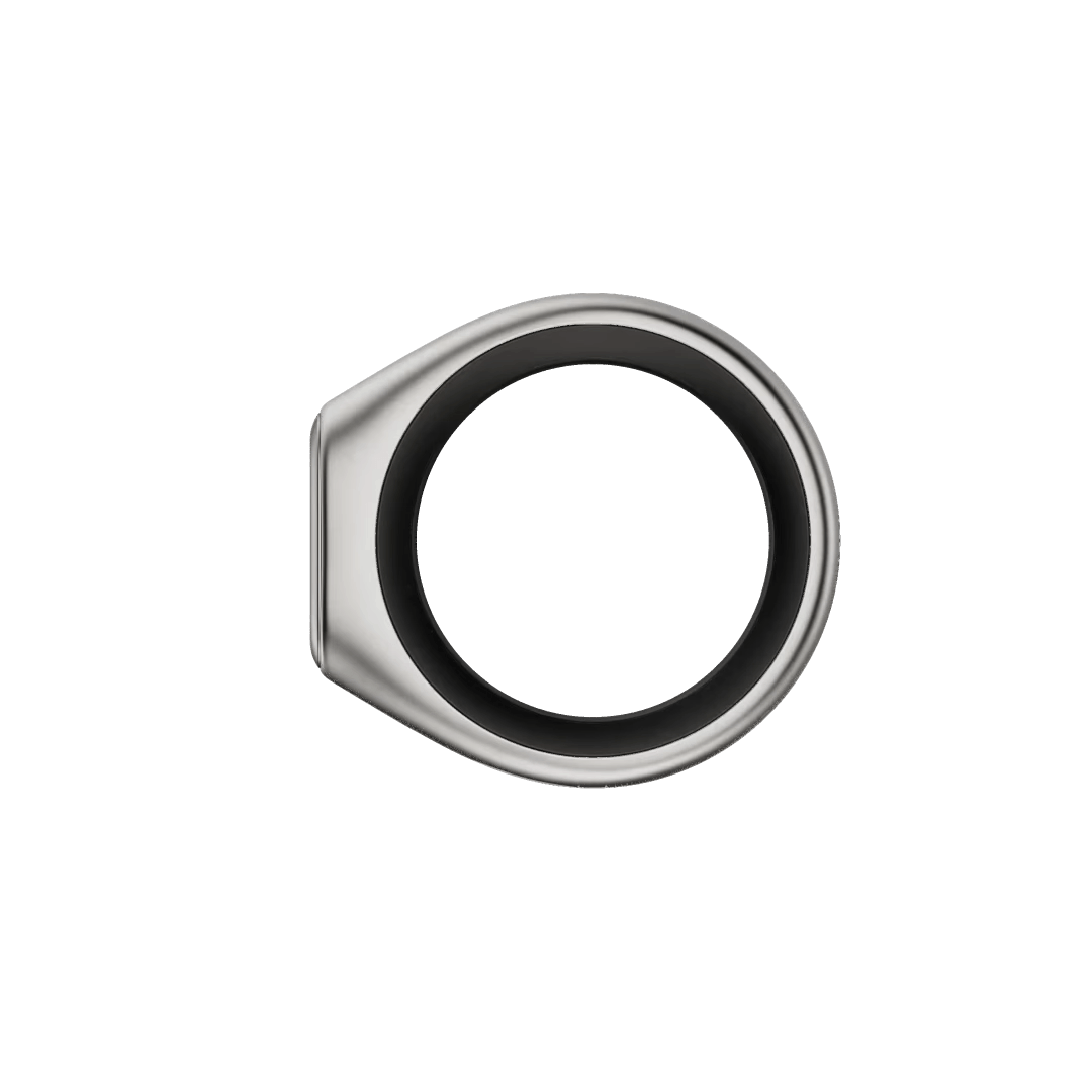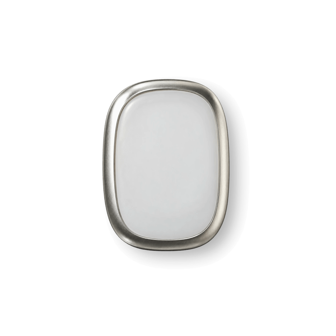
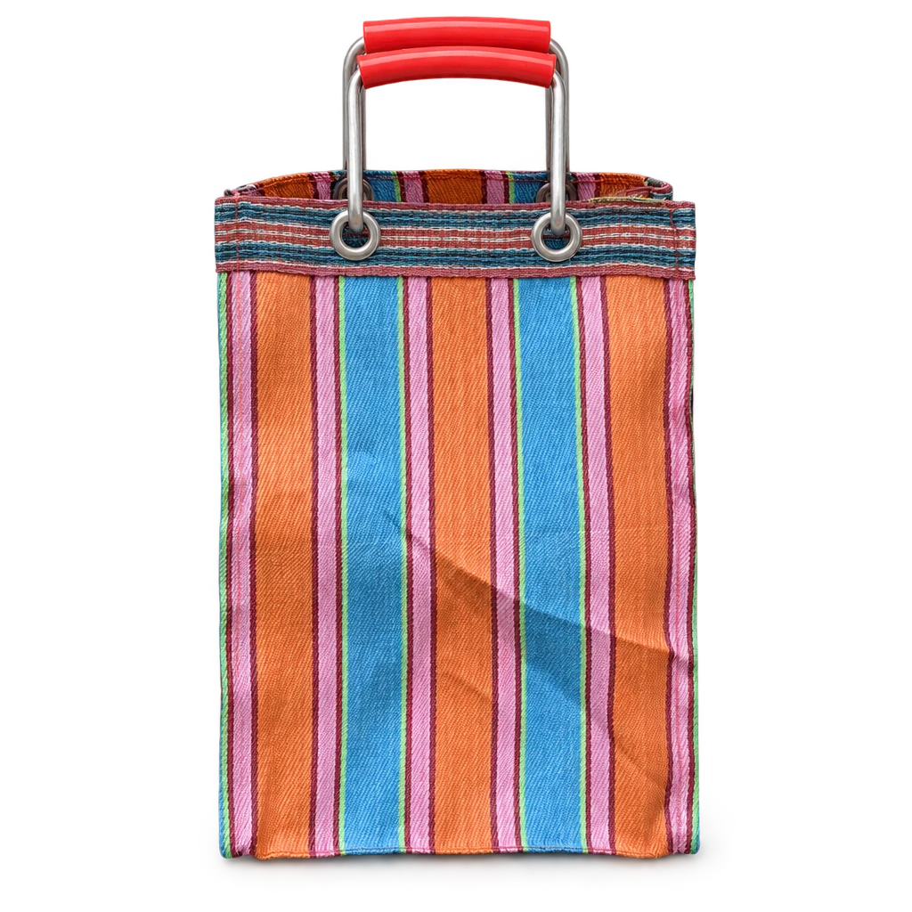
Archiv turns quick photographs of physical objects into crisp archival images, automatically correcting perspective and lighting before identifying and researching each object. The result is a growing collection of documented objects, complete with information about what they are and where they came from.
Archiv was conceived, designed and built in-house under Think With Your Eyes, the Design Office's incubator for independent projects.
The Archiv wordmark uses tightly kerned lettering and an almost excessive application of ligatures, giving it the quality of something carved in stone rather than something you'd expect to see on a software product. It's a nod to the idea of archiving as an act of preservation, of recording things for posterity, even if the objects being documented are entirely contemporary.
The rest of the app is far more utilitarian, with minimal sans-serif typography, fine lines, and very little decoration. Brand elements are used sparingly, so when they do appear, they can afford to have a little more character.
A series of custom pictograms introduces a more playful side to Archiv's visual identity. Each contains a small, self-contained scene, with an almost symbolic quality reminiscent of early forms of visual communication.
The graphics bring a little character to the brand, referencing something historical while remaining distinctly contemporary in their execution.
Archiv's interface is deliberately minimal, with clean typography, fine lines, and a system of custom icons and animations.
Every interaction is designed to feel precise and functional, while retaining a subtle sense of personality. The emphasis is on utility and clarity, with the smaller details providing character without competing with the objects themselves.
Archiv's interface is built around a deliberately physical, card-based system. The idea was loosely inspired by the drawers of individual records you'd find in a traditional archive, something you could pull out, flick through, stack and rearrange. Throughout the app, objects exist as distinct cards that sit alongside one another, overlap and move through space, giving the interface an underlying sense of physicality.
That thinking extends to the interactions themselves. The collection grid can be pinched and zoomed, with objects shifting in scale and position as you move between an overview and a closer look. Even the social feed treats each object as an individual card rather than another piece of content in a continuous stream.
It's a fairly restrained approach to bringing physicality into a digital interface, creating a sense of dimension and tactility without resorting to skeuomorphism. Everything remains minimal and distinctly contemporary, but with a subtle sense that you're actually handling a collection of things.
Archiv's onboarding begins by having users photograph their first object, immediately introducing the core functionality of the app.
While the image is being processed and researched in the background, a short guided tour introduces the interface. By the time the tour is complete, the first archival image and its accompanying research are ready to reveal.
The entire sequence was carefully structured to turn a potentially lengthy technical process into a seamless and engaging first experience.
Archiv's image processing is designed to preserve the character of the original object, including its imperfections, rather than generate an idealized version.
Perspective, lighting, and presentation are corrected to create the equivalent of a carefully photographed studio image, while retaining the details that make the original object unique.