Tolan is an AI companion developed by Portola, where users form a relationship with their own animated alien through conversation. The characters have distinct personalities, remember previous interactions, and evolve alongside their human companions.
With the characters and an early version of the product already established, the pre-launch identity work focused on developing a more confident, considered visual language that could appeal to a wider audience while retaining the personality of the Tolans themselves.
The project encompassed the visual identity, app icon, and website, followed by several ongoing collaborations developing different aspects of the app's design and experience.
Original character design by Eran Hilleli and in-house creative by Lucas Zanotto.
The idea behind Tolan's visual identity was to treat the characters' digital world as a real place, and have the brand exist within it.
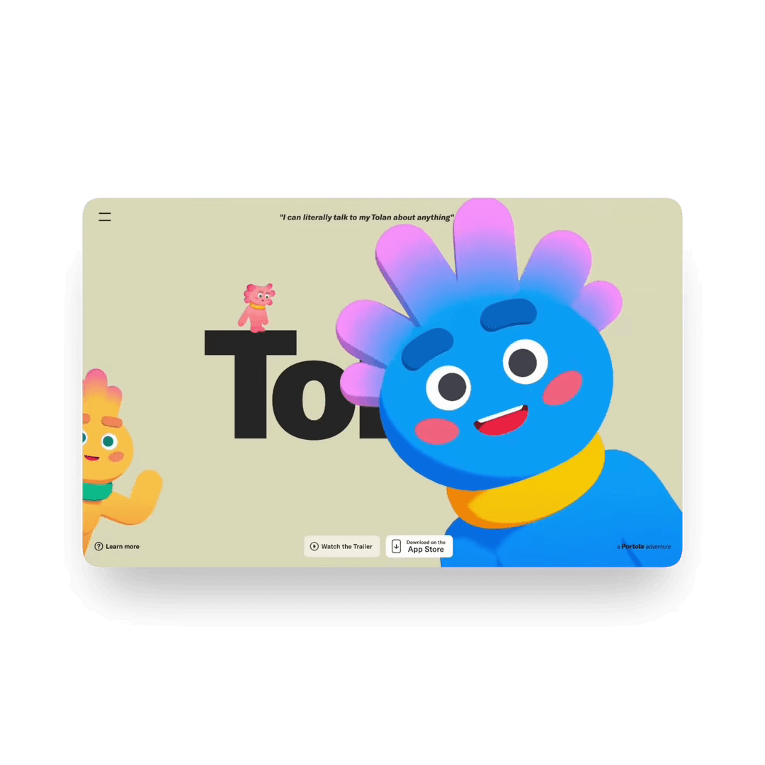
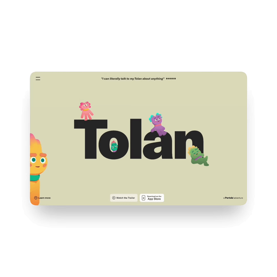
What would happen if the Tolan logo was dropped into their world? Suddenly it's a physical object. Characters can climb over it, sit on it, walk in front of it, or disappear behind it. There's a sense of weight and dimensionality to the identity, blurring the line between the brand and the world the Tolans inhabit.
The wordmark itself is a particularly heavy application of GT America by Grilli Type. Its bulky, rounded forms feel quite harmonious with the characters, giving the brand some warmth and personality while retaining a more mature sensibility. Muted khakis and warm neutrals provide a relatively quiet backdrop, letting the Tolans remain the focus.
The identity also introduced the line "a Portola Adventure", establishing a relationship between Tolan and its parent company.
It's a small piece of brand architecture that acknowledges Portola without interrupting the character-led nature of Tolan, allowing the product to maintain a distinct identity within the wider company.
The app's splash screens became an opportunity to bring the visual identity directly into the product. The oversized wordmark, warm khaki backgrounds, and playful use of scale and layering create a series of simple, character-led compositions.
The Tolans can interrupt the typography, emerge from behind it, or occupy the space around it. Even these small moments are treated as part of their world, rather than conventional branded loading screens.
Early explorations of the app focused on establishing how typography, interface elements, and the characters themselves could coexist within a consistent visual language.
The challenge was finding a balance between the expressive, sometimes chaotic nature of the Tolans and the clarity needed for a functional software interface. Confident typography, simple layouts, and a relatively restrained use of graphic elements give the characters room to do their thing, while introducing a more considered typographic style across the product.
Subsequent collaborations with the Tolan team explored more atmospheric, character-led experiences within the app, including a series of almost oracle-like personality screens.
These took the visual language in a distinctly different direction, with oversized typography, deep shadows, and saturated color creating something a little more mysterious and theatrical. An opportunity to push the expressive range of the product while retaining the recognizable personality of the Tolans.